Beautiful Data Inc.
Unit: MIS771_TRI-2_2025
GoodNews Live Dashboard
Use the filters (State, Category, Channel, Membership, Date) to explore sales, profitability, and trends. Hover for tooltips; click marks to highlight related data across charts.
Unit: MIS771_TRI-2_2025
Use the filters (State, Category, Channel, Membership, Date) to explore sales, profitability, and trends. Hover for tooltips; click marks to highlight related data across charts.
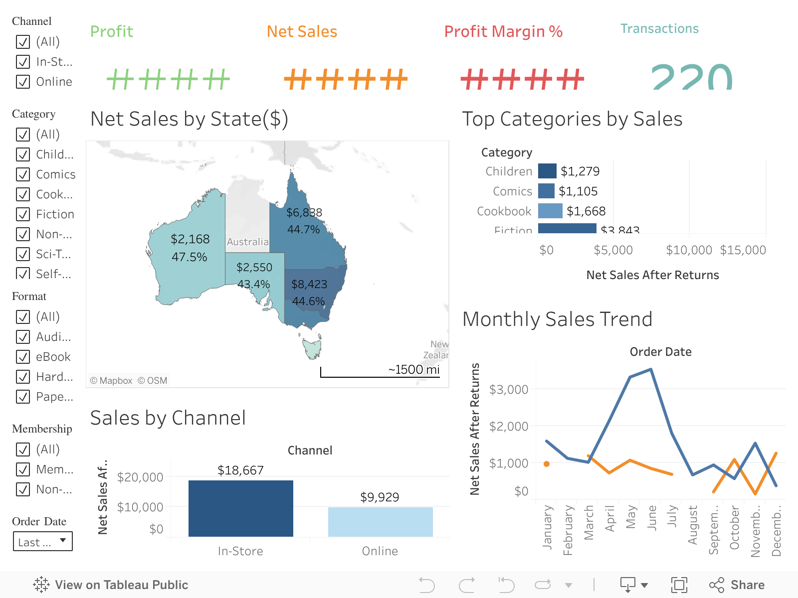
The dashboard is structured for a Regional Sales Manager: KPI tiles provide an instant health check, followed by regional, categorical, channel and temporal views. A promotions chart tests whether discounts help or harm margins. Filters persist across all views to support quick, targeted questions.
Net Sales, Profit, Profit Margin %, Return Rate % summarise performance at a glance. Consistent number formatting (currency/percent) supports quick scanning and comparison after filters are applied.
A filled map of Australia encodes Net Sales by state. It quickly surfaces hotspots and gaps; labels and tooltips add Profit and Margin for context. Geographic drill focuses stakeholder attention on where to act.
Horizontal bars compare Net Sales and show Margin via colour, helping prioritise high-value categories. Sorting reveals leaders immediately; a Format filter (Paperback/Hardcover/eBook) enables a deeper cut when needed.
Online vs In-Store performance is displayed side-by-side to guide channel investment decisions. Margin colour highlights profitable mix shifts, while labels show exact values.
A monthly line chart (split by Channel) shows seasonality and the timing of spikes or dips. This supports campaign evaluation and planning for peak periods.
Discount % vs Profit Margin % with bubble size = sales tests whether higher discounts translate into profitable sales. Outliers (high discount, low margin) inform more disciplined discounting.
A limited palette (sales in blues, margin accents) and consistent encodings reduce cognitive load. Layout follows a top-down narrative: KPIs → region → category/channel → time → promotion effect. Filters are grouped and labelled clearly; tooltips use business language.
Labels, tooltips, and adequate contrast improve readability. Keyboard focus is supported by the Tableau embed; alt text provided for the iframe title.